Stateful CSS
A design-system CSS methodology for building accessible, maintainable components whose interface behavior and affordances are derived from declared markup state instead of duplicated class state.
Problem
Design-system CSS gets difficult when the same state is represented in too many places. A React component may know it is loading, the DOM may expose aria-busy, and the stylesheet may still depend on a separate .is-loading class. Variants, hover rules, disabled states, sizes, themes, and one-off overrides all begin to multiply across the same properties.
This matters most in shared component libraries. A button is not just a button: it is a contract between design, engineering, accessibility, tokens, product teams, and future contributors who need to change it safely.
<button className={cx( "button", variant === "primary" && "button--primary", size === "small" && "button--small", isLoading && "is-loading", )} disabled={isLoading} aria-busy={isLoading}> Save</button>The bug risk is not the syntax. The risk is that styling has its own parallel state machine.
Stateful CSS treats component styling as state management: styles are a deterministic function of native, ARIA, and data attributes already present in the DOM.
Method
The methodology has three practical rules:
- Markup declares state through native pseudo-classes, ARIA attributes, and data attributes.
- CSS binds each owned property to a scoped custom property once.
- State selectors mutate variables, not properties.
It is intentionally built from modern platform features rather than a dedicated build tool. Pseudo-classes, ARIA selectors, data attributes, cascade layers, custom properties, and :has() already give CSS enough vocabulary to model component state directly. Avoiding a required compiler keeps the methodology portable across frameworks, documentation sites, prototypes, and production design systems.
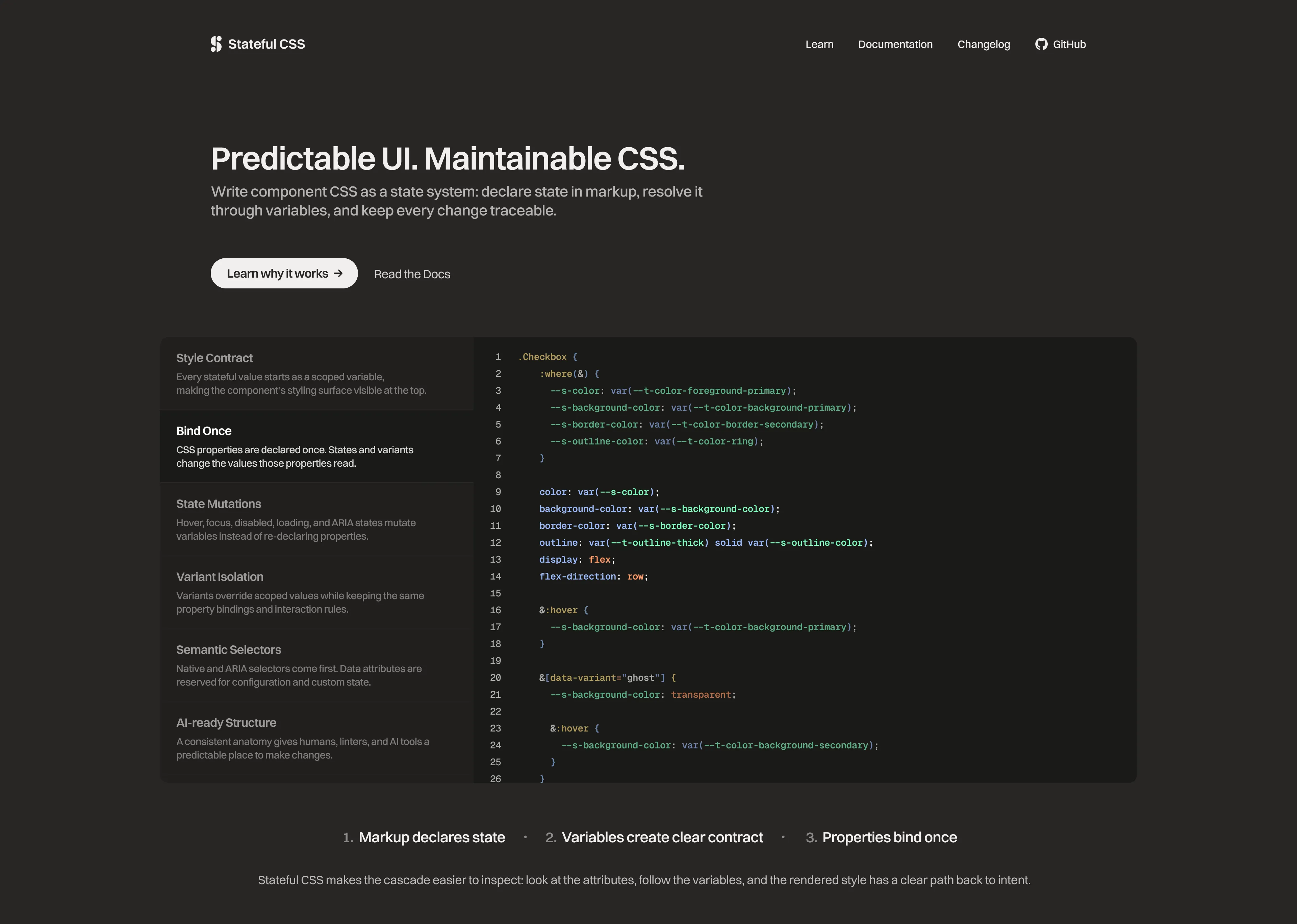
<button className="Button" data-variant="primary" data-size="small" data-loading={isLoading || undefined} disabled={isLoading} aria-busy={isLoading}> <span className="label">Save</span> <span className="spinner" aria-hidden="true" /></button>/* Defaults: the component's style contract */:where(.Button) { --s-background-color: var(--t-color-background-secondary); --s-text-color: var(--t-color-foreground-base); --s-padding-inline: var(--t-space-4); --s-padding-block: var(--t-space-2); --s-border-radius: var(--t-radius-medium); --s-opacity: 1; --s-cursor: pointer; --s-spinner-display: none; --s-content-display: inline-flex;}/* Properties: bound once */.Button { display: inline-flex; align-items: center; gap: var(--t-space-2); padding-inline: var(--s-padding-inline); padding-block: var(--s-padding-block); background-color: var(--s-background-color); color: var(--s-text-color); border-radius: var(--s-border-radius); opacity: var(--s-opacity); cursor: var(--s-cursor);}That separation makes the stylesheet easier to debug. If the background is wrong, I inspect --s-background-color. The actual background-color declaration is not repeated across every variant and state.
Accessibility As Styling Infrastructure
Stateful CSS prefers the most semantic selector available: browser state first, ARIA when accessibility already describes the state, and data-* attributes only for configuration or state with no native representation. That means accessibility state and interface feedback are not two separate systems.
.AccordionTrigger[aria-expanded="true"] { --s-icon-rotation: 180deg;}.Tab[aria-selected="true"] { --s-text-color: var(--t-color-foreground-primary);}.Field:has(input:invalid) { --s-border-color: var(--t-color-border-danger);}If a disclosure forgets aria-expanded, the interface stops communicating the expanded state correctly. That is intentional: it turns accessibility drift into an obvious implementation problem instead of a hidden audit finding.
State Selectors
For interaction states, the CSS mutates scoped variables and guards states that should not apply. Hover should not override a disabled or loading control.
.Button { &:hover:not(:disabled):not([data-loading]) { --s-background-color: var(--t-color-background-secondary-strong); } &:focus-visible { --s-outline-width: var(--t-focus-ring-width); --s-outline-offset: var(--t-focus-ring-offset); } &[data-loading] { --s-opacity: 0.7; --s-cursor: wait; --s-spinner-display: inline-block; --s-content-display: none; } &[data-variant="primary"] { --s-background-color: var(--t-color-background-primary); --s-text-color: var(--t-color-foreground-on-primary); &:hover:not(:disabled):not([data-loading]) { --s-background-color: var(--t-color-background-primary-strong); } }}Classes identify components. Attributes declare state. Variables make that state legible in the interface.
Design Tokens And Ownership
The naming model is intentionally explicit. It gives each custom property one job, which matters when a design system grows beyond a few components.
/* Tokens: design-system decisions */--t-color-background-primary--t-space-4/* Component API: values a parent or JavaScript may set */--c-button-background-color--c-tooltip-x/* Scoped variables: component-internal state output */--s-background-color--s-padding-inline/* Private values: local calculations or primitives */--_base-sizeThe important discipline is ownership. Tokens are defined by themes, --c-* values are the public override surface, and --s-* values are internal to the component. That keeps composition from turning into descendant selector leaks.
The methodology does not try to replace common CSS practices. It connects them into a stricter contract: semantic state in markup, owned properties in components, tokens at the system boundary, and variables as the handoff between state and interface response. The power comes from making familiar pieces reinforce each other.
AI-Assisted Development
The structure is designed to be friendly to humans and AI tools. When every component follows the same anatomy, an AI assistant can make narrower edits: add a variant block, update a token fallback, or introduce a new state without inventing a parallel class convention.
The next step is a Stylelint plugin that enforces the methodology locally and in CI. The goal is not to trust prompts more. The goal is to give prompts guardrails.
/* ❌ Rejected: state block re-declares an owned property */.Button[data-loading] { opacity: 0.7;}/* ✅ Accepted: state block mutates the scoped variable */.Button[data-loading] { --s-opacity: 0.7;}Rules like this would catch token redefinition inside components, unprefixed custom properties, stateful modifier classes, and data-disabled where a native :disabled selector should be used.
Decisions And Tradeoffs
I chose a verbose naming style because this methodology is meant for teams and AI-assisted authoring. --s-background-color is longer than --bg, but it is searchable, predictable, and hard to misread six months later. It also gives linters and code-generation tools a clear grammar to inspect.
I also chose not to make Stateful CSS depend on a build tool. A compiler could enforce more rules automatically, but it would also narrow adoption and make the methodology feel heavier than it needs to be. The core idea should work anywhere modern CSS works, with optional tooling layered on later for teams that want stricter checks.
The tradeoff is that Stateful CSS asks authors to be disciplined. It does not magically prevent every cascade mistake, and it does not hide CSS behind a clever abstraction. The value is that mistakes have a narrow shape: if a component communicates the wrong state, inspect the attributes and the --s-* variables instead of mentally executing a pile of competing property declarations.